For what i'm thinking of... what i'm doing... and what's inspire me... and this is how i see the world!

Monday, May 6, 2013

Ujian aku 5 tahun lepas.....

Malam tadi Barisan Nasional baru saja lulus ujian PRU-13nya yang paling gentir.... walaupun bukan dengan cemerlang, tapi masih lagi berjaya dalam ujiannya....

5 tahun yang lepas, pada tarikh yang sama...... Aku juga melalui satu ujian. Ujian yang menentukan sama ada aku dapat berbakti kepada rakyat... ataupun terus menjadi orang biasa yang pentingkan hal kocek sendiri.... Dan Alhamdulillah... 5 tahun lepas, telah aku lulus dengan jayanya....

Ketika itu, sebelum aku di interview oleh para penal.... aku telah diminta untuk buat satu ujian sketches ... dan ini hasilnya (yang agak buruk strok drawingnya...)
"Soalan:- Anda dikehendaki untuk melakar rekabentuk produk kraf yang berkaitan dengan kepakaran bidang anda. Lakaran produk tersebut perlu disesuaikan mengikut situasi yang sesuai di mana mengambarkan ciri-ciri produk tersebut. Rekabentuk produk tersebut perlulah menepati kehendak pasaran semasa, tetapi masih mengekalkan ciri-ciri tradisional. Anda digalakkan untuk mencatatkan idea secara kasar pada lakaran tersebut untuk menyokong lakaran konsep. Anda bebas mengunakan medium untuk membuat lakaran. Anda perlu menyiapkan lakaran dalam masa 45 minit."

COKMAR HOLDER....

Aku pun tak tahu macamana idea cokmar holder ni boleh ada dalam otak aku.... dan terus menjadi lakaran di atas kertas ujian yang diberi.... (Tindakan bawah sedar aku...). Boleh kira detail juga explanation aku dalam sketches ini- dah macam technical drawing pun ada.

Kombinasi rehal, pending, motif songket & batik dan segala bagai idea mengarut yang datang untuk 10 minit pertama, dah cukup untuk hasilkan sketches ini.... Dalam kerja aku yang sebenar pun, tak mencapai tahap explanation konsep se detail ini..

Sebenarnya, aku baru terjumpa gambar ini. Dalam timbunan gambar-gambar koleksi 2008.....Oleh sebabkan tarikh ini ulang tahun ke-5 aku dalam Kraftangan. Aku tributekan posting ini untuk sketches yang menyebabkan segalanya menjadi kenyataan...


Alhamdulillah amin...


Wednesday, April 17, 2013

Man of Steel Trailer #3.... The Best Ever!

Officially, trailer ini baru sahaja release di IMDB semalam....

Sampai hari ini, dah berpuluh-puluh kali aku tengok. Tadi baru saja aku convert masuk ke dalam iPad Mini (untuk menemani perjalanan ku ke Langkawi... )

There's something about this trailer that's really make me stunted!!!.... the score by Hans Zimmer maybe.All the scene were perfectly choreograph into one emotional journey of superhero, Speechless....

Betul-betul aku speechless dan meremang bulu tengkuk aku, setiap kali tengok Trailer ini.... Bagi aku, the best ever trailer..... Nice work Nolan.... Nice work Snyder.... Enjoy!


"It's not an 'S'.... in my world, it means hope..."

.......

"How about Supe...zzzzzz....,"
"Excuse me...."

 Damn!!! 


Friday, April 5, 2013

Bivacco Gervasutti: Inspirasi yang datang dari tebing Gunung!!

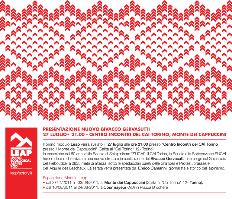
Sekali pandang gambar ini, otak aku dah memproses data-data yang boleh dimanipulasi di atas situasi yang sama dalam gambar ini...

(Photo: Photograph by Francesco Mattuzzi / Courtesy of The Leap Factory)
Bivacco Gervasutti di tebing Mont Blanc, Italy direka oleh Luca Gentilcore and Stefano Testa

Bivacco bermaksud kawasan perkhemahan sementara yang menggunakan bahan semulajadi, yang digunakan oleh pendaki gunung.... Gervasutti pula merujuk kepada Giusto Gervasutti (17 April 1909 – 16 September 1946), seorang pendaki terkenal Italy yang terbunuh semasa mendaki di Mont Blanc du Tacul.  

Bivacco Gervasutti dibina untuk menggantikan pondok pendaki di East Face, Grandes Jorasses, yang telah dibina semenjak 1948 yang menggunakan prefabricated wooden construction. Bivacco Gervasutti merupakan hasil dari Projek LEAP - Living Ecological Alpine Pod - yang merupakan environmentally conscious alternative kepada para pendaki yang perlukan tempat berlindung sementara semasa sesi pendakian mereka. Semestinya projek sebegini tak menjadi isu di Malaysia.

~ ~ ~ ~

Apa yang bermain-main di otak aku sebenarnya penggunaan motif jacquard weaving berwarna merah, kontra dengan badan capsule bewarna putih yang menyebabkan ia nampak begitu menyerlah dari jauh- dan yang penting ia 'masuk' (tak jumpa ayat yang sesuai...) dengan suasana pergunungan sekeliling. Menurut artikel dari Domus, motif red jacquard ini mewakili iconography tradisional sebuah pergunungan di sana....

Aku terpikir, adakah Batik Malaysia punyai peluang yang sama?... Signifikannya sesuai guna di mana?....

Projek yang berjaya menyelesaikan hampir kesemua isu yang patut di 'tackle' hari ini- Go Green!!-Pre-Fab---> Bina di tempat lain dan hanya pindahkan tanpa perlu mengubah (mungkin memusnahkan?!!) kawasan persekitarannya.

"Bringing the “Pre-fab” notion to a whole new level, the Living Ecological Alpine Pod, or LEAP, offers an environmentally conscious alternative to traditional mountain shelters. Assembled off-site and then flown into its desired location, the LEAP goes green via its unique plane and ship-style construction technologies. A biological toilet, thermally isolated doors and electric induction cooker are just a few of its refined interior attributes, while the self-sustaining home is outfitted with an array of technologies that allow it to self-diagnose structural issues, weather conditions, maintain emergency communications and generate power naturally through its exterior photovoltaic films. The core benefits of the LEAP are rooted in its ability to leave a significantly less footprint on the environment due to its greater mobility and self-sustaining capabilities."
Taken from HYPERBEAST


Adios.....


Tuesday, March 12, 2013

~Quote of the week~

Architecture-really?!!

"....People may not have the professional capacity to comment on production of architecture, but they are in the right place to comment on reception of architecture......"

taken from my ex-colleague's FB Wall
Xeem Nor


~ ~ ~

If architect and designer don't read more on critical analysis of architecture, DOES that mean they do not care about the reception of their work so long as the production happens?....

Mind you, what you read in magazine are mostly the architect intention and not the critical review.....


I think, we still need both....


~Quote of the week~

Wednesday, October 24, 2012

Tun's comment on recent putrajaya architecture

Taken from Tun Mahathir's recent post on Chedet.cc dated 22nd Oct 2012..... I add-up some photo for a better understanding of what Tun's posting on...

~ ~ ~ ~

PUTRAJAYA

1. I believe people must have noticed a certain architecture associated with Putrajaya. The brown colour of the buildings set it apart from other major development in the country. The design of the buildings also differ from those usually found in this country. 
 
Palace of justice- The five-domed Court
2. Then there are the mosques which reflect Islamic features while not being reproductions of those in other Muslim Countries. The five-domed Court building is perhaps the most impressive (some people think it is a mosque). Each Ministry building has its own design with each having some distinct shape so that they are different from the others.
 

3. The mosques too are unique with one being more traditional and the other ultra modern. Yet they blend with the architecture of Putrajaya.

Senibina macam ini ke yang Tun maksudkan???....
4
. Unfortunately a new building has been added which is made up of glass, with no architectural features. It is not very imaginative as it looks like match boxes stacked on each other. It would be fantastic for New York but it is not Putrajaya. It is not very Malaysian or Islamic. It is in fact entirely out of place.

5. Of course this is only my opinion. Others will think otherwise.

6. I was in London recently. There you may do anything you like inside the house but the facade must remain as it was when it was built. You immediately know you are in London when you are in London.
7. It is the same with Paris. The roofs of the buildings in Paris are unique to Paris. And you immediately feel you are in Paris and nowhere else when you are in Paris.

8. I would like to think that a century from now people would know they are in Putrajaya because of the uniqueness of the city architecturally.

9. Every country has its own architectural feature. Spires and steeply sloping roofs are common in East Asia but each country has its own particular shape. Thailand, China, Korea and Japan all have the gracefully steep sloping roofs which terminate with upturned corners and edges. But still they manage to be unique for their countries through the variations in details.

10. For that matter every state in Malaysia has its own unique architecture. We never had high rise buildings. For a time we did not know what to do to make these skyscrapers look Malaysian. But now we have brought back the Malaysian roofs to top our high rise buildings.

11. They are actually utilitarian. We had flat roofs before. But somehow rain water manage not only to form puddles which refuse to evaporate, but often they find some cracks in the cemented roof to leak into the room below.

12. But with the roofs there are no more puddles and the water does not leak into the room below anymore. I am sure somebody will tell me that the leaks are still there.

13. The high rise flats in Putrajaya also have roofs. But the buildings are not enclosed entirely in glass like in America. They are different from the main boulevard with its ministerial building but they do not stick out like a sore thumb like that pile of glass boxes sticks out.

14. Please Putrajaya Holdings, please keep the uniqueness of Putrajaya’s archictecture.


~ ~ ~ ~ ~


Inilah yang aku patut tahu dari awal kenapa Putrajaya menjadi sebegitu rupa..... Apa yang sebenarnya cuba diusahakan oleh Master Planner Putrajaya yang sebenar..... Tun mahukan Putrajaya punya identiti yang tersendiri... Bukan menjadi tempat lambakan bentuk-bentuk senibina yang tak punya arah tuju.....

So, Aku tak mahu komen apa yang Tun katakan tentang senibina Putrajaya... (itu pandangan Tun). Kalaulah aku diberi peluang untuk paham dengan mendalam apa yang ada dalam otak Tun.... Pasti aku akan lebih menghargai Putrajaya yang diciptanya...


Monday, October 1, 2012

Apa Beza Theme-line, Tagline, Ad Tagline & Slogan

photo by Jurvetson

Sedang aku brainstorm Projek Pameran SDSI 2012, muncul masalah apa itu Tema, Tagline dan sebagainya... Akhirnya aku sendiri terpaksa membuat research tentang perkara-perkara tersebut...

Posting aku kali ini adalah lebih kepada reminder untuk diri sendiri (dan siapa yang berminat....) tentang apa itu Tema (Brand Theme line) & Tagline (Tagline, Ad Tagline dan Slogan).... Topik yang sedikit sebanyak ada kaitan dengan design proses, tapi lebih kepada dalam Marketing Communication....

1) BRAND THEME-LINE

"A brand theme-line is locked into the corporate logo and is designed as part of the mark. Its usage, placement, color, font choice, and size are all spelled out in the corporate identity standards manual and the logo should never appear without it.

A brand theme-line is forever. It needs to be refreshed to take advantage of sea changes in the market space but it is a strategic element to the brand’s success and promise."

2) AD TAGLINE

"An advertising tag line is a tactical element that is designed to dimensionalize the brand’s benefit in a specific advertising campaign. It changes regularly (although more often than it should) to reflect the newness of a campaign. Most often, the advertising tag line is a benefit statement. 

The Brand theme-line is a permanent equity."


3) TAGLINE

"A tagline is a brief phrase that will help the corporation be well known in its industry for years to come. The main purpose of taglines is to help the organization market its products or services to a certain demographic. It also briefly states what the organization’s goals are for the product."


4) SLOGAN

"Slogans are only used in certain advertising and marketing campaigns that an organization decides to take part in. The slogan changes all the time so that the slogan can be current and resonate well with consumers. Some slogans might make the consumer feel safe and include phrases such as; we put our customers first or customer satisfaction guaranteed.

Both slogans and taglines are approximately a sentence long but both need to be well thought out and concise. If you are marketing a product then it is essential to understand your business identity and make it evolve over time."


short article of ;
TAGLINE & SLOGAN was taken from The Business Identity Factory
BRAND THEME-LINE & AD TAGLINE was taken from Stealing Share

So.. let's get the work done!


Wednesday, August 8, 2012

Another amazing Eid TVC by PETRONAS

New approach by PETRONAS for their Eid-ul-fitr Annual Ads...  PETRONAS was among the 'big company' to use short-film-oriented-ads as their television commercial trademark for every Malaysian Festive season.... But this time, they had put a new benchmark---->its a Short Film


Erman, a PETRONAS engineer stationed in Central Asia, struggles to adjust to life away from home, when his path crosses that of a local boy, Jeyhun.

While Erman and Jeyhun start out as strangers, every step brings them closer to realising their true potential, to reimagining their energy and making a difference to those around them. Its a story of one man's journey of self-discovery and exploration towards the meaning of life

 Taken from PETRONAS Official Youtube Channel

STRANGER; directed by Quek Shio Chuan of Reservoir Production, starring Redza Minhat as Erman..... Uzbek's Shavkatov Sarvar as Jeyhun and Nishanov Bohodir as the Teacher. ‘Reimagining Energy’ had been PETRONAS tagline.... and its show in this short film.


Related Posts Plugin for WordPress, Blogger...